Case study
Travel booking app
Project overview
In this project journey, I focused on meeting specific requirements for creating a user-friendly travel booking app. The website included important pages like the homepage, 'About Us,' location information, and a contact page. With a clear and consistent design, the goal was to make the website easy to use. Users could find trips easily using the search tool on the homepage and other pages. Once they found a trip, they could book it without any hassle.
The website provided useful information on every page, along with the search form. It also had sections for the 'Privacy Policy' and 'Terms and Conditions.' Users could manage their personal information and trips, including canceling bookings, through the 'My Account' section.
To promote communication, the website had a messaging feature for users to contact the travel organization. The admin panel allowed administrators to efficiently handle bookings, including viewing, deleting, and managing travel listings. Users could leave reviews for the various travel options available on the platform
Design proces
Branding
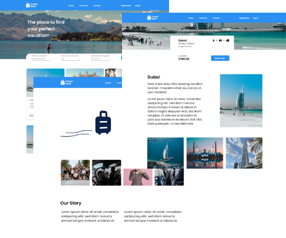
At the beginning of the design process, I worked on creating a unique brand identity that reflected the values of the travel booking platform. The aim was to make the platform feel friendly, reliable, and adventurous. I chose a calming shade of blue to convey a sense of reliability and openness, which are essential for travel.
Logo


The logo, which included a travel suitcase and the name 'Traveldock,' was designed to represent the platform as a dependable and welcoming 'dock' for travelers, providing a secure and trustworthy hub for all their travel needs. For the font, I chose 'Poppins' for its readability and modern, sleek look, which suited the platform's contemporary and user-friendly interface. Poppins is known for its simple lines and friendly appearance, perfectly complementing the inviting nature of the platform and establishing a consistent visual identity that encourages trust and comfort for users as they navigate the website
Font
Header 1
Poppins semibold 1.25rem
Header 2
Poppins semibold 1.125rem
Header 3
Poppins medium 1rem
Colors
Primary
#2C8FF2
Secondary
#3E557E
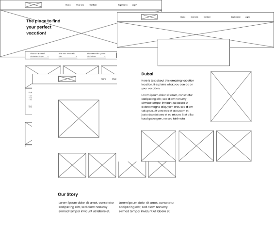
Page design
Turning the brand identity into actual design, I carefully created simple layouts to ensure an easy-to-use interface that matched the platform's friendly and trustworthy character. I used the established brand elements to develop more detailed designs, integrating the calming blue color scheme and the 'Traveldock' logo. Each design element, from the structure to the images, was chosen carefully to connect with the platform's values, creating an attractive interface that builds trust and appeals to users' sense of adventure
Developing proces
I used Laravel, which was a new framework for me, although I was familiar with PHP. I also used Tailwind CSS, my first experience with a CSS framework. The development began with creating basic elements, such as making static pages and setting up the feature to display travel options. Later, I worked on creating the search function and an admin panel for managing travel details.
I tested the functionalities during the development phase by trying different actions, like searching and reviewing the outcomes. For security, I relied on the built-in safety tools in Laravel.
To make the travel listings, I used an editor that showed how the final page would look. Since I worked alone, I used Git for keeping track of the project's progress